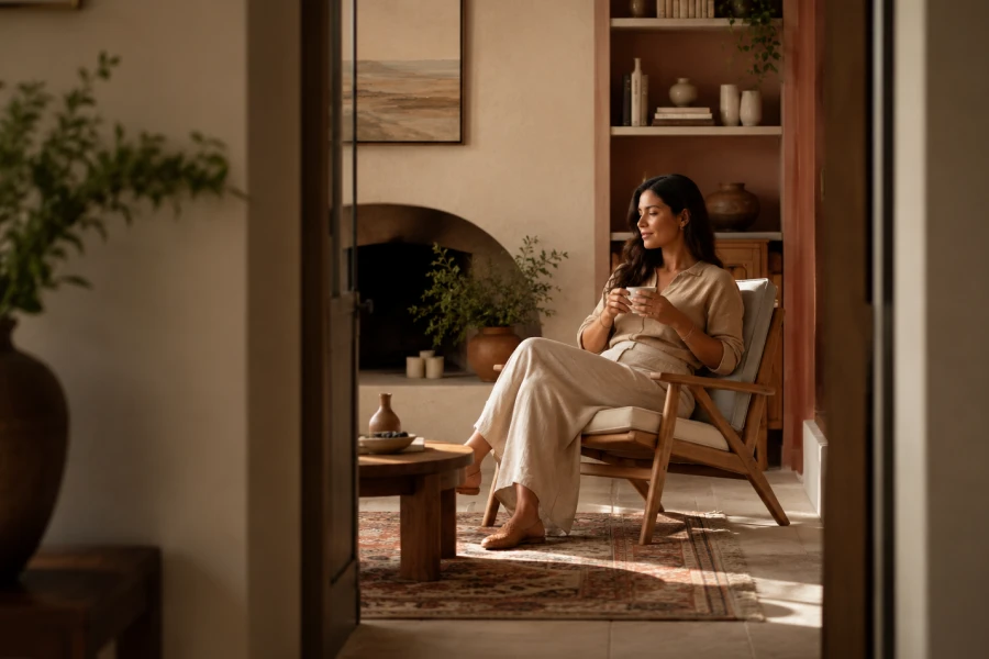
Some rooms feel peaceful before you can explain what works. Harmonious spaces usually come from aligned color, light, texture, and proportion. Nothing screams for attention. Nothing feels forgotten. The palette supports the furniture, and the furniture supports the mood. This does not mean every room must look neutral. Harmony can be bold, layered, dramatic, or soft. It simply means the pieces belong together. When your colors stop competing, your home feels more settled. The result is emotional ease, not showroom perfection. That shift can change how you live inside the space.
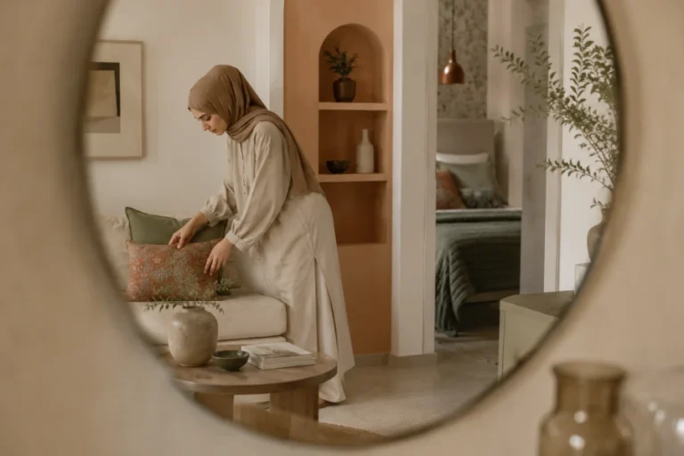
Repetition gives the eye a path. A color repeated in fabric, art, and accessories feels intentional. A wood tone echoed across rooms creates continuity. A metal finish repeated gently can make mixed pieces feel related. This does not require matching sets. In fact, too much matching can feel stiff. The goal is visual rhythm. Use one dominant color, one supporting color, and one accent. Then repeat each in different strengths. A cohesive decorating palette helps rooms feel connected without becoming predictable.
Light can make or break a palette. A room with soft daylight may welcome gentle contrast. A darker room may need warmth, reflection, or deeper intention. Lamps matter as much as windows. Cool bulbs can make warm walls look strange. Warm bulbs can make crisp colors feel creamier. Layered lighting helps color work at different times. Use overhead light sparingly. Add table lamps, floor lamps, and shaded light where possible. These choices help the room feel human. Color looks best when lighting supports how people actually use the space.
Color temperature controls emotional balance. Warm colors often feel intimate, sunny, and welcoming. Cool colors can feel clean, quiet, and spacious. Problems appear when the room mixes temperatures without intention. A cool gray sofa may clash with yellow walls. A warm beige rug may fight icy white trim. You do not need perfect sameness. You need a bridge. Wood, cream, soft black, muted green, or textured fabric can connect temperatures. Harmonious spaces often succeed because transitions feel considered. The room does not jolt your eye from one mood to another.
Editing is not the same as removing character. It means deciding what deserves attention. Too many colors can make a room feel restless. Too few can make it feel unfinished. Start by identifying the strongest visual elements. Then ask whether each supports the mood. Remove colors that appear only once without purpose. Repeat favorite accents in smaller ways. Keep meaningful pieces, but give them better surroundings. This approach respects personality while improving calm. A color confidence method can help you edit without stripping the room bare.
Texture prevents harmony from becoming flat. A quiet palette needs linen, wool, wood, ceramic, glass, or woven details. These materials create depth without visual clutter. They also make neutral rooms feel intentional. A beige room with no texture can feel dull. A beige room with boucle, oak, stone, and soft cotton can feel luxurious. Color still matters, but surface quality carries emotion. Texture also helps bold colors feel livable. A deep blue wall feels calmer beside natural fibers. A rust accent feels softer when paired with matte finishes.
One room can look beautiful and still disrupt the home. Flow matters when spaces are visible from one another. Repeat undertones from room to room. Carry one neutral through several areas. Let accent colors change gradually rather than suddenly. Use art, rugs, and textiles as bridges. Open-plan spaces need especially careful transitions. Separate zones can have different personalities, but they should still speak the same design language. This is where AI palette planning can compare options before you commit.
A harmonious home does not need flawless styling. It needs choices that support your routines. If a color makes you tense, it does not belong. If a room looks beautiful but feels cold, something needs softening. Pay attention to how your body responds. Sit in the room at different times. Notice where your eye rests. Notice what feels loud. Small changes can create major relief. A warmer bulb, softer curtain, or repeated accent may be enough. Design works best when it helps daily life feel easier.

Leave a comment