The right room can calm your shoulders before you notice why. That is the quiet power of color psychology in home decor, especially when your space feels almost right but never complete. Color affects mood, appetite, focus, rest, and energy. It also changes how furniture, light, and texture appear together. A pale wall can feel airy in one home and washed out in another. A warm shade can feel cozy, or it can feel heavy. That difference usually comes from context. Light, flooring, scale, and personal habits all matter. When you understand those relationships, decorating becomes less random and more intentional.
Most people choose paint by preference first. That makes sense, but preference alone can mislead you. A color you love on clothing may overwhelm a living room. Another shade you ignore online may look elegant at sunset. Your home responds to color through mood and movement. Bedrooms need softness, while dining corners may welcome warmth. Workspaces often need clarity without sterile brightness. Entryways can feel more welcoming with gentle contrast. The goal is not to follow strict color rules. Instead, you build a feeling that supports your real life.
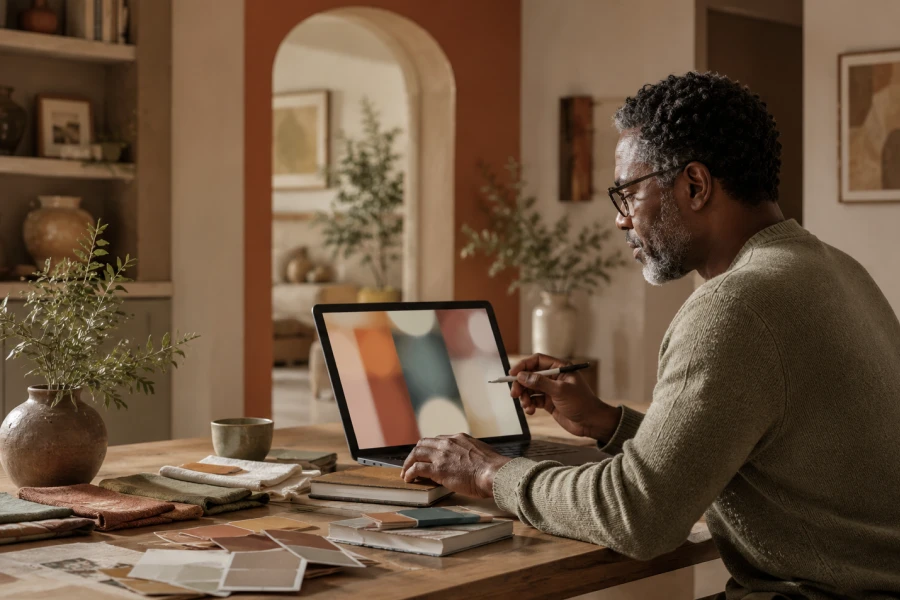
Before choosing a palette, study what already exists. Floors, cabinets, rugs, metals, and window views all influence color. Natural light shifts throughout the day. North-facing rooms often need warmth. South-facing rooms may tolerate cooler tones. Artificial lighting changes undertones at night. A beige wall can turn pink, yellow, or gray under different bulbs. That is why sampling matters. You need to see color in morning, afternoon, and evening. For a more confident process, a home color planning system can help you connect mood with materials.
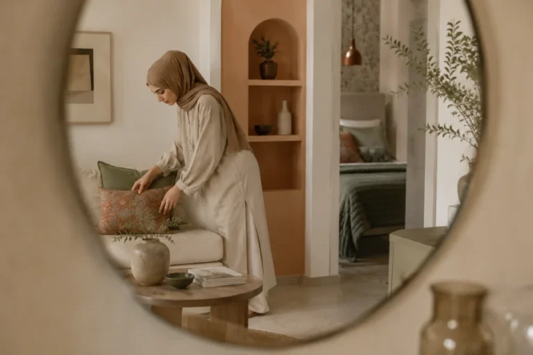
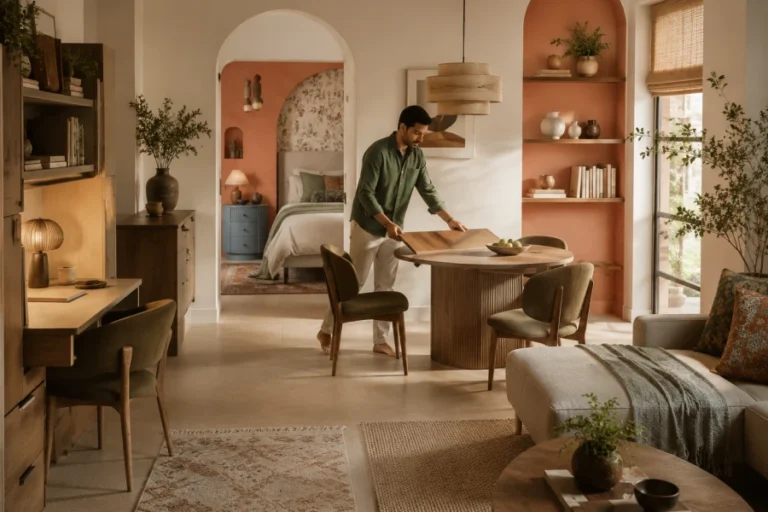
Every room asks for a different emotional temperature. Living rooms often need balance because they host many moods. You relax there, talk there, scroll there, and sometimes work there. Kitchens usually benefit from color that feels clean but not cold. Bathrooms can become small retreats with muted spa tones. Bedrooms need visual quiet, even when the style feels rich. Kids’ rooms can hold playful color without becoming chaotic. Hallways work well with transitions that tie spaces together. Your palette should not repeat itself mechanically. It should move through the home with rhythm and purpose.
Contrast gives a room structure. Without it, even beautiful colors can look flat. The trick is choosing contrast that matches the room’s purpose. Black accents can sharpen a soft palette. Wood tones can warm cool walls. Cream textiles can soften deep colors. A dark cabinet can make a pale room feel grounded. Too much contrast, however, can interrupt calm. Too little contrast can make the room feel unfinished. Think of contrast as punctuation. A balanced interior palette gives your eyes places to rest and places to focus.
Color never works alone. Texture decides whether a shade feels elegant, rustic, bright, or soft. Olive linen feels different from olive lacquer. Powder blue velvet feels different from powder blue tile. Matte finishes absorb light, while glossy surfaces reflect it. Woven baskets can make crisp white feel relaxed. Brass can make green feel more classic. Chrome can push the same green into a modern direction. This is why palettes should include materials, not just swatches. You want the room to feel layered. Texture turns color from an idea into an atmosphere.
AI can make palette planning faster, but it still needs good direction. Ask for mood, lighting, and material pairings, not random color names. Share room purpose, existing furniture, flooring, and natural light direction. Request warm, cool, muted, and contrast variations. Then compare those options against real samples. AI can organize possibilities, but your room decides what works. This approach reduces expensive mistakes. It also helps you see combinations you may not consider alone. For homeowners who want structure, AI interior color ideas can turn inspiration into a clearer decorating path.
A beautiful palette should still feel like you. Trends can inspire, but they should not erase your personality. Notice which colors make you breathe easier. Notice which shades make you restless. Think about the time of day you use each room most. Consider what you want guests to feel when they enter. Also consider what you want to feel when nobody else is there. The best palettes create emotional recognition. They make a house feel settled, considered, and lived in. When color supports your routines, your home becomes easier to love.

Leave a comment